Configuration
HDConfig
Two fields, and both are required.
| Parameter | Type | Default | Description |
|---|---|---|---|
activity | ComponentActivity | required | The activity hosting the SDK UI. Must be a ComponentActivity, since the UI is Compose. |
onTokenRequest | suspend () -> String | required | Returns a valid Halo SDK token. A suspend context, so fetching it from your backend needs no extra plumbing. A plain lambda still fits; Kotlin converts it. |
Everything else is your brand file — colours, type, the marks, the language, the scheme logos, the link scheme, the kernel your short App Links resolve against, how an inbound payment is presented, and every switch the SDK offers. There are two runtime setters, setLanguage and setThemeMode, and only because a merchant's own choices are the one thing no build can state. Why the rest are files, in one line: an inbound payment runs none of your code, so anything only a call could say is a thing that flow cannot know.
What is left is what a file genuinely cannot state: activity and onTokenRequest exist only while you are running. Your app's package name and version are read from the platform, so you do not supply those either.
Example
import za.co.synthesis.halo.sdk_ui.HaloSdkUi
import za.co.synthesis.halo.sdk_ui.models.HDConfig

val config = HDConfig(
    activity = this,
    onTokenRequest = {
        // Return your Halo SDK token here (e.g., fetch from your backend)
        "YOUR_SDK_TOKEN"
    },
)

HaloSdkUi.prepare(config)          // at your splash
val result = HaloSdkUi.init(config) // suspending, once you have a token
init returns the SDK's HaloInitializationResult — its resultType and errorCode carry why when bring-up failed — or null when a step failed before the SDK could report at all. It is idempotent: a second init on a live SDK answers with what it already has.
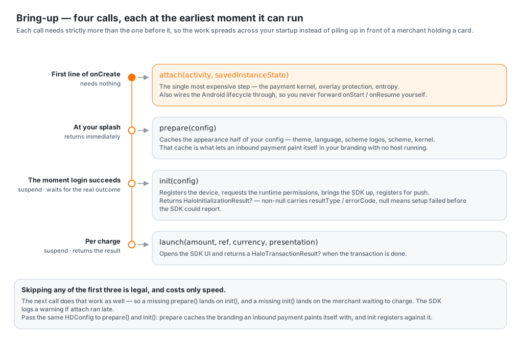
What Each Call Does
attach(activity, savedInstanceState) hands the SDK its Android context: the payment kernel, overlay protection, entropy. It is the single most expensive step of bringing the SDK up, and it needs nothing from you but the activity — so run it first, immediately after super.onCreate, and everything your app does afterwards runs against a payment stack that is already loading. Anywhere later and the cost lands on whoever is waiting next. It also wires the Android lifecycle through to the SDK — you do not forward onStart/onResume/onPause/onStop yourself. Pass savedInstanceState straight through so the SDK can restore its own state across a process death. Cheap to call more than once.
prepare(config) is not a suspend function, returns immediately, and cannot fail in a way you have to handle. It reads your brand file and its language, and warms the tap screen's artwork in the background — which is what lets an inbound payment, brought up natively with no host in the process, still show your branding and speak your language.
init(config) is a suspend function — call it from a coroutine. It registers the device (re-attesting only when the token's identity has changed since last time), requests runtime permissions (Permissions) alongside bring-up rather than before it, and suspends until the SDK reports its real outcome: registered, attested, initialized, kernel settled. Call it the moment your login succeeds rather than from your payment screen: the merchant is almost certainly still navigating, which is free time this can run in.
Presentation
HDPresentation.FULL_SCREEN (the default) is the SDK as its own app: an opaque activity that replaces yours for the length of a charge.
HDPresentation.SHEET presents the charge as a bottom sheet with your app dimmed behind it, so it reads as your app asking for a card rather than another app taking over.
HaloSdkUi.launch(amount, merchantRef, currency, presentation = HDPresentation.SHEET)
Nothing goes in your manifest. launch takes its own presentation, so consecutive charges can differ — see Taking a Payment — and your brand file's presentation key answers for the flows that arrive with no launch call at all, such as an intent or a payment link.
What a Sheet Covers
A sheet is the same screen, smaller. Same parts, same order, same type hierarchy, laid out for a shorter surface rather than redrawn for it — every page declares a heading, a body and an optional footer, and one shell arranges them, so portrait, landscape and sheet all fall out of the same declaration. The whole charge lives in one sheet with pages changing inside it, so bring-up handing over to tap is not one surface closing and another opening. The keypad and the detailed breakdown stay full-screen either way.
One thing belongs to the sheet alone: a top bar carrying your logo on the left (leading rather than centred, so it does not shift as the actions change width) and, on the right, the buttons a full-screen page puts at its foot (Cancel, Share receipt, Charge).
Swiping the sheet down, tapping the dimmed area, and pressing back all raise a cancel confirmation, on the bring-up screen as well as on tap. The sheet never simply closes, because an accidental swipe would otherwise abort a live card read.
A window's surface format is fixed at creation, so the SDK's activity is created translucent and converts itself to opaque for a full-screen charge (Activity.setTranslucent, API 30+) — full-screen brands are unaffected. Under a sheet your app is no longer stopped behind the payment surface: it keeps rendering next to a live card read, and another app's pixels are visible behind a card-present screen, which is the shape overlay protection exists to catch (HaloErrorCode.OverlayDetected).
A Link Your Own App Scanned
A host that starts HDActivity itself, handing over a link it scanned rather than one the OS routed to it, can say which presentation to use for that flow:
startActivity(
    Intent(this, HDActivity::class.java)
        .setData(Uri.parse(scannedLink))
        .putExtra(HDActivity.EXTRA_PRESENTATION, HDPresentation.FULL_SCREEN.name)
)
The extra outranks the brand file's presentation for that one flow, and leaving it out changes nothing. It exists because a link the OS delivered arrived from outside, where a sheet over the host is right, while a link the host scanned is the merchant charging from their own screen, where a sheet would float the charge over the viewfinder that just read it.
SDK Version & Device Installation ID
HaloSdkUi.sdkVersion returns the underlying Halo SDK's own version string, for a host that displays it (e.g. beside a link to the PCI listing the SDK is certified under). It's a property of the library, so it's readable before attach.
val version = HaloSdkUi.sdkVersion
HaloSdkUi.deviceInstallationId(context) returns the Halo installation id for this app on this device — what the kernel knows the install by, and what you'd present to register the device for Push to Terminal. It is null until the device has registered at least once, since the SDK is only handed the id inside init's own device registration; from then on it survives launches and process deaths.
val installation = HaloSdkUi.deviceInstallationId(context)
Theming
Your brand is a file. State it once in your build, as src/main/assets/halo/brand.json, and the SDK reads it on every bring-up:
{
  "light": {
    "primary": "#FF6200EE",
    "secondary": "#FF3700B3",
    "tertiary": "#FF7C4DFF",
    "accent": "#FF03DAC6",
    "surface": "#FFFFFFFF",
    "onSurface": "#FF000000",
    "onPrimary": "#FFFFFFFF",
    "outline": "#FFCCCCCC",
    "error": "#FFB00020"
  },
  "dark": { "primary": "#FFBB86FC", "surface": "#FF121212", "onSurface": "#FFFFFFFF" },
  "shape": 12,
  "style": "HORIZONTAL",
  "gradient": ["secondary", "tertiary", "primary"],
  "logo": "brand-logo.svg",
  "icon": "brand-icon.svg",
  "schemeLogos": { "amex": false, "discover": false },
  "font": "Helvetica",
  "text": { "label": 14, "value": 16 },
  "scheme": "yourscheme",
  "presentation": "SHEET",
  "receipt": ["share", "print"]
}
There is no call to make and nothing to pass at init. Every key is optional, and what you leave out is Halo's own. The bottom rows are behaviour rather than paint, and they are in the same file for the same reason: a brand that hands out no receipts, or takes its payments as a sheet, is that brand on every flow — including the ones that start with none of your code running.
Brand File Keys
| Key | Type | Default | Description |
|---|---|---|---|
light | object | Halo's light scheme | Light-mode colours |
dark | object | Halo's dark scheme | Dark-mode colours |
shape | number | 16 | Corner radius, in dp, for buttons and containers |
style | string | "HORIZONTAL" | How the surfaces carrying your accent are filled: "SOLID" for flat primary; "HORIZONTAL", "VERTICAL", "DIAGONAL_LEFT" or "DIAGONAL_RIGHT" for your ramp — see Fill |
gradient | array | ["secondary", "primary"] | The colours your ramp runs through, in order: two to four of primary, secondary, tertiary and accent — see Fill |
logo | string | the Halo logo | Your logo, serving both light and dark modes |
icon | string | your launcher icon | Your square app mark, used where the SDK has one glyph's worth of room. Today that is the small icon on a pushed payment's notification |
font | string or object | the platform's own | The typeface the screens are set in: a family name, or the family plus the files you ship it as — see Type |
text | object | the Material 3 scale | Type sizes in sp — see Text Sizes |
schemeLogos | object | all on | Which card scheme logos are shown: nfc, visa, mastercard, amex, discover, elo, each a boolean |
themeMode | string | "SYSTEM" | "LIGHT", "DARK" or follow the device. A merchant's own pick, where you have passed one to setThemeMode, comes ahead of it |
language | string | the device's | "en", "af", "zu", "fr", "de", "es", "pt". A merchant's own pick, where you have passed one to setLanguage, comes ahead of it — see Languages |
languages | array | all seven | The languages your app offers, e.g. ["en", "af"]. Every candidate is held to it — the pin and the merchant's own pick included — see The Ones Your App Speaks |
currencies | array | all four | The currencies your app charges in, e.g. ["ZAR", "USD"]. Its head is what the keypad opens on, and what an amount with no currency of its own is denominated in — see Currencies |
presentation | string | "FULL_SCREEN" | "SHEET" puts inbound payments over the app that sent them — see Presentation |
scheme | string | "halo" | The custom scheme your payment links arrive on. Must match the halo_url_scheme resource — see Build Configuration |
kernel | string | none | The kernel that short App Links resolve against — see Short App Links |
kernelPins | string | none | SHA-256 SPKI fingerprints for kernel's TLS certificate, semicolon- or comma-separated |
showTransactionResult | boolean | true | Whether the SDK shows its own result screens — see Handling Results |
receipt | boolean or array | ["share"] | Which receipt actions the result screen offers. true/false turns both on/off; an array names them — ["share", "print"], or carve one out with ["-print"]. Print shows only where the device has a printer — see Receipts |
emailReceipt / smsReceipt | boolean | true | Which of the receipt sheet's two fields are drawn — see Receipts |
receivePush | boolean | false | Whether this device registers to receive pushed payments — see Push to Terminal |
analytics / crashReports | boolean | false | What the SDK reports about itself — see Telemetry |
A colour is #AARRGGBB, 0xAARRGGBB, a bare RRGGBB (opaque) or a packed integer, so the same hex your colors.xml and your designer use goes straight in. The colours themselves are primary, secondary, tertiary, accent, surface, onSurface, onPrimary, outline and error; name only the ones you are changing. tertiary and accent exist for a ramp of more than two colours. Leave them out and they are your secondary and primary.
The logo is a self-theming template SVG, so one asset serves both surfaces. The SDK substitutes the active colour scheme into placeholder tokens before rendering: {{PRIMARY}}, {{SECONDARY}}, {{TERTIARY}}, {{ACCENT}}, {{ERROR}}, {{SURFACE}}, {{ONSURFACE}} and {{OUTLINE}}. Any token left unreplaced renders as an invisible fill. Both logo and icon are asset paths in your own APK, so a Flutter host names its bundled mark flutter_assets/assets/brand/logo.svg.
Fill
Some surfaces carry your accent rather than sitting on the surface colour: the primary button, the top bar's action pill, the row of step dots, and any illustration drawn on your own ramp. style says how they are filled.
| Value | What it draws |
|---|---|
"HORIZONTAL" | Your ramp, left to right. The default, and what every brand had before this key existed |
"VERTICAL" | The same ramp, stated for a host whose own splash runs top to bottom |
"DIAGONAL_LEFT" | The same ramp, stated for a host whose own splash runs from the top-left corner to the bottom-right |
"DIAGONAL_RIGHT" | The same ramp, stated for a host whose own splash runs from the top-right corner to the bottom-left |
"SOLID" | Flat primary, no ramp |
Hyphens and spaces read as underscores, so "diagonal-left" is DIAGONAL_LEFT. An unknown value, or none, is HORIZONTAL: a host built against a newer generator does not lose its ramp to a name this version has not heard of.
SOLID changes anything here, and that is deliberateA direction is a choice about a full-height backdrop, and the SDK draws none. Every ramped surface it has is a strip, and a gradient running down a strip is a gradient nobody can see. Send the whole value anyway, so that your app and the payment screens agree about what the brand asked for, and so the decision stays the SDK's if it ever grows a surface tall enough to turn.
The Ramp's Colours
The ramp is secondary running into primary unless you say otherwise. gradient says otherwise: two to four of your theme's colours, by name, in the order the ramp runs through them.
{
  "light": { "primary": "#FF440BD4", "secondary": "#FFFF0090", "tertiary": "#FF6F08C4", "accent": "#FF01FFFF" },
  "gradient": ["secondary", "tertiary", "primary", "accent"]
}
They are names rather than colours so that each scheme resolves them for itself, and the dark ramp is your dark colours. A name the SDK does not know, or fewer than two, and the whole key is ignored: a ramp missing a stop would be a different gradient, and secondary into primary is at least one your brand has seen.
The buttons, the action pill and the step dots run through it, and so does your artwork. A two-stop <linearGradient> from {{SECONDARY}} to {{PRIMARY}} is re-stopped evenly across your ramp, keeping the axis it was drawn on. One drawn {{PRIMARY}} first takes the ramp reversed, so it still ends where it was drawn to. A gradient with more than two stops was drawn through your colours on purpose, like a brand mark, and is left exactly as drawn.
Flat
SOLID reaches your logo too. A <linearGradient> whose stops name both {{SECONDARY}} and {{PRIMARY}} is your ramp, and every ramp colour in it, {{TERTIARY}} and {{ACCENT}} included, is flattened to primary with the rest. A gradient that names real colours, or only one of the two, belongs to the illustrator and is left exactly as drawn, so a card scheme mark or a flag keeps its own shading. The ramp flattens to primary whatever gradient says, which means onPrimary is still the ink that sits on it and nothing else on the screen changes.
Why It Is a File, Not a Config
All of this used to be parameters on HDConfig, and being parameters made them a lie. An inbound payment brings the SDK up cold, natively, in a process where no host code has run and nothing has called init, so an app whose brand existed only in a call had no brand at all on the flow a cardholder was most likely to see. What the SDK had was the last config it had been given, which is nothing on an install that was never opened or has had its data cleared — and those payments came up in Halo's own colours on a merchant's phone.
A file is in the APK before the app has run once, and on the launch nobody made. So the brand is stated where it cannot go missing, and two places answer for the SDK: the file for what this app is and where it talks, and HDConfig for the live wiring, which is the one thing a file cannot hold.
A language picker and a light or dark switch are the two exceptions, and they are the exceptions that draw the line. A person's choice is not something the build knows, so no file can hold it. Yet the payment screens have no picker or switch of their own to correct them with, so leaving them on the file would strand a merchant who changed your app. setLanguage and setThemeMode resolve it the file's way rather than a call's: the SDK records what you tell it, and reads it back on every bring-up, including the one at four in the morning that ran none of your code. Your colours, fill and type stay the file's, so what a cardholder sees is your brand whether the charge started on your keypad or arrived as a link.
Following Your App's Theme
If your app lets the merchant pick light, dark or the device's setting, tell the SDK what they picked:
import za.co.synthesis.halo.sdk_ui.models.HaloThemeMode

HaloSdkUi.setThemeMode(context, HaloThemeMode.DARK)   // null forgets it
Call it at startup and whenever the merchant changes it. It is cheap and idempotent, and a payment screen already showing repaints on the spot. What you pass comes ahead of your brand file's themeMode; null forgets it and puts the screens back on the file's.
Type
Say nothing and the screens are set in the platform's font, which is what they always were. font changes that, and there are two ways to say it.
A family name, when the typeface is one the device already has:
{ "font": "Helvetica" }
The family and your own files, when it is not — and this is the only form that is certain of what gets drawn:
{
  "font": {
    "family": "Helvetica",
    "files": [
      { "asset": "fonts/Helvetica.ttf", "weight": 400 },
      { "asset": "fonts/Helvetica-Bold.ttf", "weight": 700 },
      { "asset": "fonts/Helvetica-Italic.ttf", "weight": 400, "italic": true }
    ]
  }
}
Each asset is a path in your own APK, like the logo, so a Flutter host names its bundled file flutter_assets/assets/brand/Helvetica-Bold.ttf. weight is 100 to 900 — 400 regular, 700 bold — and it defaults to 400. State it: Android's asset font takes your word for the weight rather than reading the file, so a bold cut handed over as 400 is drawn wherever regular was asked for and the bold on top of it is synthesised. A weight you ship no file for is synthesised from the nearest one you did.
Name the family even when you ship files. It is what a cut you did not ship falls back to, and it is the same name your own screens set their text in, so the two sides of a charge cannot disagree about what the brand is.
helvetica, arial, tahoma and verdana are aliases to the system sans-serif in Android's own fonts.xml, and any family the device does not have resolves to it too. Either way you get Roboto, drawn without complaint. If the typeface matters, ship it.
A file the SDK cannot open is dropped with a line in the log and the rest of the family carries on — a payment screen is never held up over a typeface.
Text Sizes
Every piece of text asks for a role, not a size, and the text object says how big each role is, in sp. Change one and every screen using it follows. Line spacing scales with the size, so larger type never collides.
| Key | Default | Used for |
|---|---|---|
display | 45 | The amount, and nothing else |
titleLarge | 22 | A page's headline ("Payment Approved") |
title | 16 | Section headings and button labels |
body | 14 | Running text |
bold | 16 | Emphasis within running text |
label | 12 | The left side of a detail row |
value | 14 | The right side of a detail row |
The defaults are the Material 3 type scale, so a brand that says nothing about text looks exactly as it always has. Sizes honour the device's font-size accessibility setting.
{ "text": { "label": 14, "value": 16 } }
Currencies
The SDK charges in rand (ZAR), pounds (GBP), euros (EUR) and dollars (USD). If your app settles in fewer, say so in your brand file:
{ "currencies": ["ZAR", "USD"] }
The head of the list is the one that matters: it is what the keypad opens on, and what an amount arriving with no currency of its own is denominated in. Put the currency you mostly charge in first. Say nothing and nothing is narrowed — the list is all four, headed by the rand.
The rest stay on the sheet, greyed. Narrowing a list by deleting from it tells a merchant nothing — a sheet holding one row reads as a build that forgot the others, and "where did dollars go?" has no answer on the screen that would answer it. Greyed, the row says which of the two it is: this SDK charges in dollars, this app does not. The sheet is therefore always all four, in the SDK's own order, and your order decides the head rather than the rows.
What it narrows is the merchant's choice. An amount that arrives already denominated — a launch carrying a currency, a parsed payment link, a DCC quote — is charged in the currency it came in, because re-denominating someone else's amount would charge a different sum of money under the same number.
It belongs in the file rather than in a call for the usual reason: an inbound payment brings the keypad up with none of your code in the process to narrow anything.
Languages
The SDK ships English (en), Afrikaans (af), Zulu (zu), French (fr), German (de), Spanish (es) and Portuguese (pt). Three things can answer, and they are tried in this order: what your app told it the merchant chose, then your brand file's pin, then the device. English backs anything none of them lands on, and any key a translation is missing.
Pin one in your brand file:
{ "language": "af" }
Say nothing and the SDK follows the device, which is what a merchant's phone already reflects.
Following Your App
If your app has a language picker of its own, tell the SDK what the merchant chose:
import za.co.synthesis.halo.sdk_ui.core.HDLanguage

HaloSdkUi.setLanguage(context, HDLanguage.AFRIKAANS)   // null forgets it
A code your app carries as a string, "af" or a BCP-47 tag like "af-ZA", goes through HDLanguage.fromCode, which answers null for anything this release does not ship — and null is the right thing to pass on, since it puts the screens back on their own resolution rather than leaving them in the language chosen before.
Call it wherever your app resolves its own language — at startup and on every change — and the payment screens follow. Without it they resolve on their own, so a merchant who switches your app to Afrikaans still taps the card against whatever the phone is set to: the payment screens have no picker to correct it with.
What you say here comes ahead of the pin above, because your app resolved through that pin to reach it. The SDK records it rather than holding it, which is what carries the choice onto the flow none of your code takes part in — a payment that arrives at four in the morning is in the language your merchant chose.
The Ones Your App Speaks
Following the device is right until your app does not speak what the device does. If yours ships in English and Afrikaans, say so:
{ "languages": ["en", "af"] }
Every candidate is then held to that list — the pin included — so a French phone takes its payments in English rather than in a language the rest of your app has never shown. English backs the fall-through; an app that does not offer English gets the first language it does. Say nothing and nothing is narrowed.
It belongs in the file rather than in a call for the sharpest version of the usual reason: the payment screens have no language picker of their own, so the build is the only thing that can ever narrow them — and an inbound payment narrows them with none of your code in the process.
Saying It Your Way
Any string the SDK shows can be reworded per app. Ship a partial catalogue in your own assets at assets/lang/overrides/<code>.json, containing only the keys you say differently:
{
  "tap_and_hold": "Hold the card against the back of the phone.",
  "payment_approved": "Paid"
}
That is the whole of it — there is no call to make. The file is laid over the SDK's catalogue whenever a language loads, so everything you don't name stays as translated, and a string added in a later SDK release is live the day you take it.
An asset rather than a call, for the reason your appearance is one: it is in the APK before your app has run, so a payment that arrives first is worded the way you meant.
It cannot fail your build, so it is logged instead. HDLang warns with the file and the keys it could not place, the first time that language loads.